Barcode Labels: Correct Printing, Readability and Application
A practical guide to barcode standards, contrast, module width, printing methods, material selection, common application errors and a pre-production barcode checklist.
Read the articleThe goal in a barcode label is not aesthetics but correct readability. When contrast, print quality, size and the quiet zone are planned correctly, the barcode is read in a single pass on every scan.
Highlights in This Category
A barcode is the machine-readable identity of a product or carton. For this reason, when a barcode label is designed, the cost of reading errors is taken into account: a barcode that is not read in a single pass means an extra step and loss of time at the warehouse or checkout.
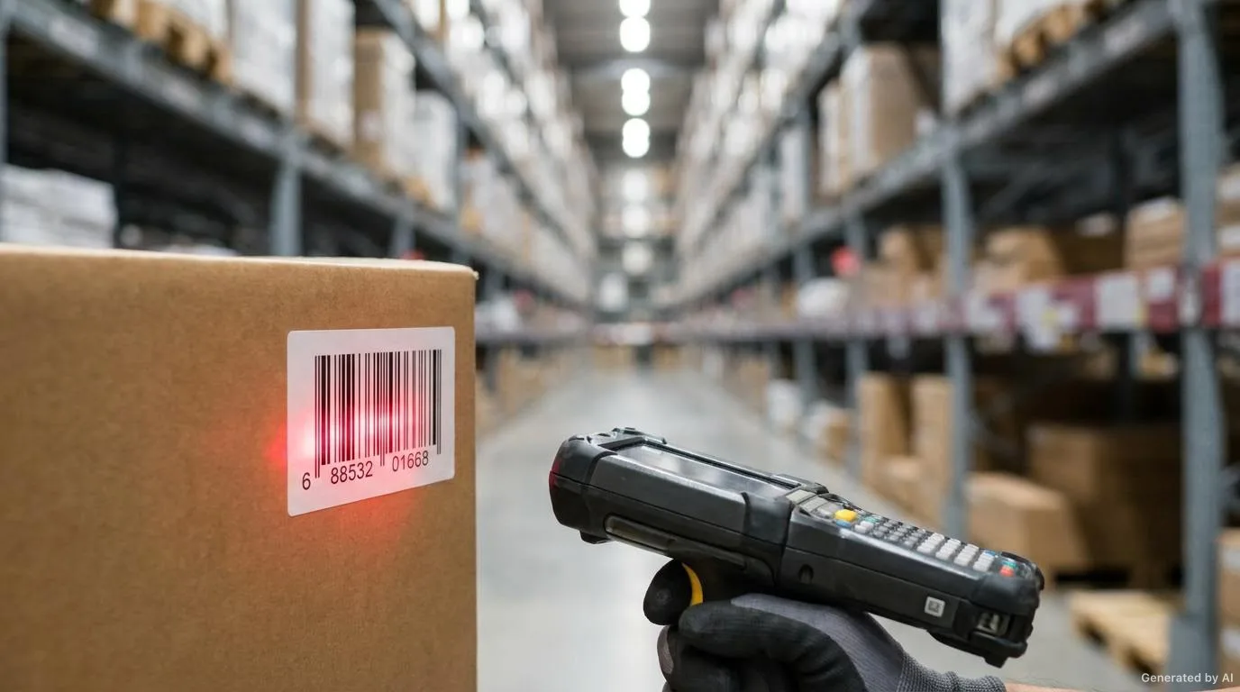
The most important factor determining readability is contrast. The dark bars of the barcode must be printed on a light background, at sufficient size and with clean edges. When the background is chosen dark, or when a surface that reflects light comes over the barcode, the reader cannot distinguish the bars.
The clear area around the barcode (the quiet zone) is the most frequently overlooked criterion. Enough space must be left on either side of the barcode for the reader to catch it correctly. Barcodes placed too close to the edge can become unreadable once the cutting tolerance is added.
In barcode labels, thermal and thermal-transfer printing are two common approaches. Thermal printing requires no additional consumable but is more sensitive to temperature, friction and light. Thermal transfer, by contrast, uses a ribbon to create a more durable print. Which is suitable is determined by the service life of the label and the ambient conditions.
Which barcode standard (symbology) will be used also varies according to the use case. Retail products, logistics cartons and internal-use labels require different symbologies. Determining the right standard from the outset prevents a system change later.
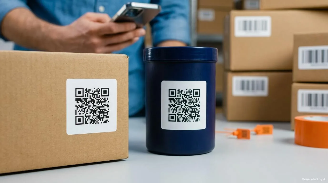
The images on this page are representative; they do not show a specific customer product or order.

Barcode labels form the basis of warehouse, logistics and point-of-sale processes.
The topics below form the basis for determining the right combination in this category. The final choice is clarified together, based on your product surface and usage conditions.
Reading the barcode requires a dark bar to light background relationship and sufficient contrast.
Space that the reader can detect must be left on either side of the barcode.
As the barcode gets smaller, the bar width decreases; a size compatible with the reader's resolution must be chosen.
Cold, humid, oily or high-friction environments affect label and print durability.
Barcode labels are usually applied quickly; adhesives that suit the surface and bond fast are preferred.
Printing and application decisions take shape according to how the label will be used on the product.
Clean bar edges directly affect the reading of the barcode.
The appropriate printing approach is determined according to service life and ambient conditions.
The barcode content and numbering scheme must be clarified before ordering.
The cutting tolerance must not affect the barcode area; the barcode must not be placed too close to the edges.
Carrying out a readability test with your own reader on the first production run eliminates problems that could be encountered in the field from the outset.
Sharing this information speeds up the quotation and technical evaluation process and reduces the need for changes during production.
It is fine if you do not have complete information; we can start with what you have and complete the rest together.
Request a Quote on WhatsAppBarcode Labels
For short-life and internal-use labels, thermal printing may be sufficient. If temperature, friction or long storage is involved, thermal transfer gives a more durable result.
The most common causes are low contrast, an insufficient quiet zone, a barcode size incompatible with the reader's resolution and print edges that are not sharp.
The resolution and reading distance of the reader to be used are decisive. As the barcode gets smaller, the bar width decreases and reading reliability drops.
Backgrounds that do not reflect light and that create sufficient contrast with the barcode can be evaluated. However, non-standard colour combinations can lead to reading errors.
It depends on the use case. QR codes carry more data and work with camera-based readers; in retail checkout processes, however, classic barcode symbologies are still required.
Roll Labels
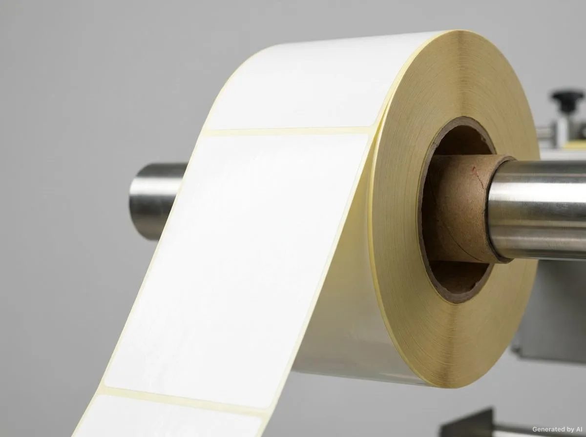
Die-cut roll labels on a carrier liner, applied quickly by machine.
Food Labels
Legible food labels suited to the packaging type and storage conditions.
Cosmetic Labels
Labels suited to bottle and jar surfaces that strengthen brand perception.
Industrial Labels
Labels resistant to temperature, moisture, abrasion and chemical contact.
Textile Labels
Self-adhesive labels used on textile and leather products.
Custom-Production Labels
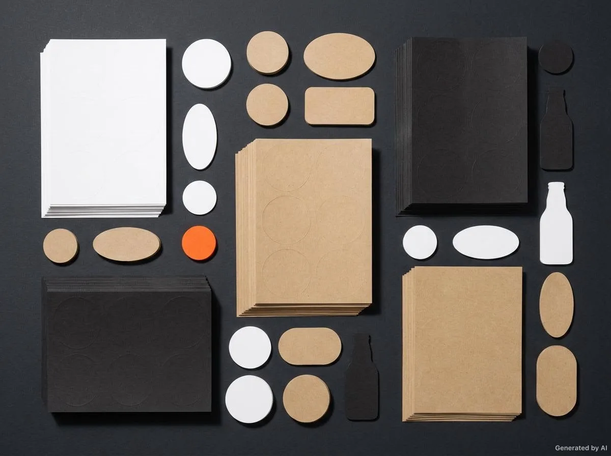
Labels requiring non-standard size, shape and design.
A practical guide to barcode standards, contrast, module width, printing methods, material selection, common application errors and a pre-production barcode checklist.
Read the article
A practical guide to pallet, carton, shelf and location labels; barcode size, reading distance, quiet zone, surface and adhesive selection, cold store conditions and resistance to abrasion.
Read the article
What is a QR code, how does it differ from a barcode, and when should you choose one on a label? This guide covers use cases, design rules (module size, quiet zone, contrast, error correction) and verification.
Read the articleShare the size, quantity, surface and usage conditions; we will carry out the technical evaluation and get back to you.
The images on this page are representative; they do not show a specific customer product or order.