Cosmetic Label Design: How to Build Premium Brand Perception
Cosmetic bottle/jar surfaces, material and surface finish selection, typography, color management, printing methods and a detailed design checklist.
Read the articleOn cosmetic products, the label is the first surface the user perceives. When the bottle and jar geometry, surface appearance and label size are planned together, both brand perception and legibility are preserved.
Highlights in This Category
On cosmetic packaging, a label offers a more flexible solution than printing directly on the packaging. As a product range grows, it is enough to change only the label design for new variants; the packaging itself can stay the same. This approach speeds up product development while preserving brand consistency.
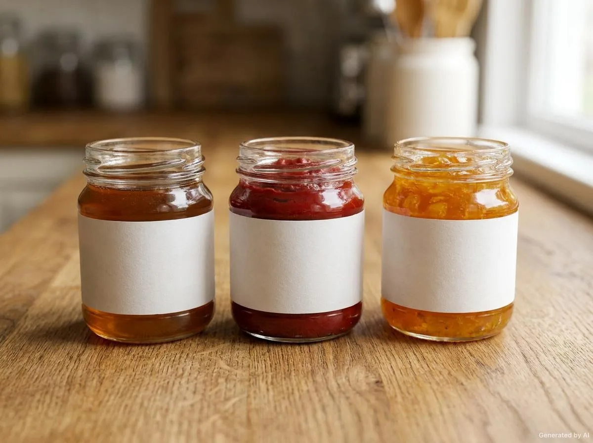
Bottle and jar surfaces are usually curved. For this reason a label is expected to sit fully on the surface, not to lift at the edges and not to crack at the seam on narrow-diameter products. On curved surfaces, thick materials can leave marks at the bends; thinner and more flexible options reduce this effect.
Typography plays a critical role in cosmetic labels: the product name, volume and usage information must be legible even at small sizes. If the label area is narrow, the information hierarchy must be clarified and the typographic contrast increased.
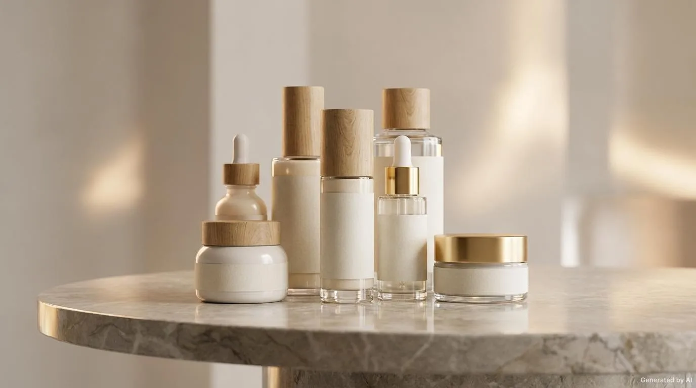
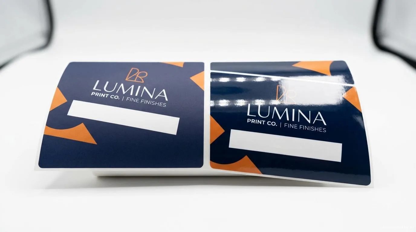
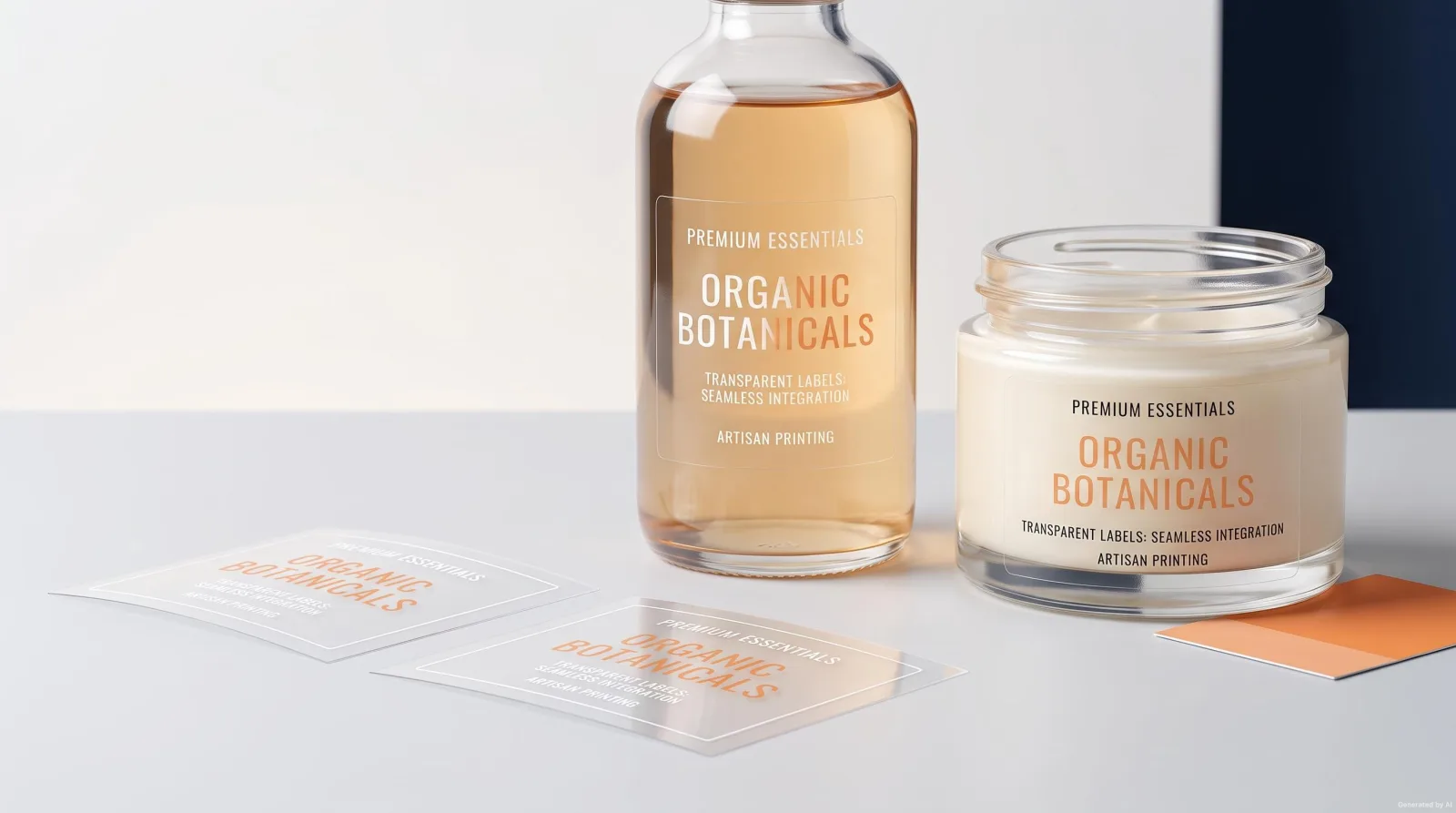
Matte, gloss, transparent and metallised surfaces give a brand a different perception. Matte surfaces offer a calm, premium look; gloss surfaces blend with the packaging. Transparent labels, meanwhile, preserve the colour of the glass surface and do not change the product appearance.
The images on this page are representative; they do not show a specific customer product or order.

A cosmetic label is a surface that carries both brand perception and product information.
The topics below form the basis for determining the right combination in this category. The final choice is clarified together, based on your product surface and usage conditions.
Glass, PET, PP and metallised surfaces require different adhesives; the packaging material and surface treatment must be clarified.
For small-diameter bottles, material flexibility and adhesive choice are evaluated together so the label neither rotates nor lifts.
The matte, gloss or transparent preference is determined by the product's brand positioning and shelf strategy.
In wet areas of use, the label's resistance to moisture and friction is evaluated separately.
The width of the label area on the bottle and the seam line must be measured before design.
Printing and application decisions take shape according to how the label will be used on the product.
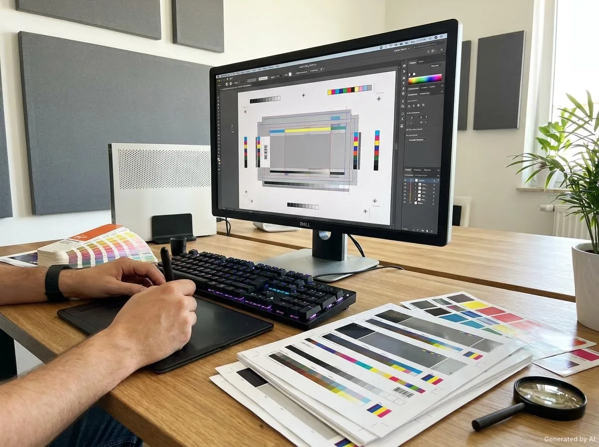
Planning prints together is recommended so that background and accent colours stay consistent across different variants of the same product range.
A clear reading order must be established for the product name, volume information and usage notes.
The appropriate printing approach is determined during the technical evaluation based on run length, number of colours and sample requirements.
Options to reduce the effect of fingerprints and friction on transparent and matte surfaces are evaluated.
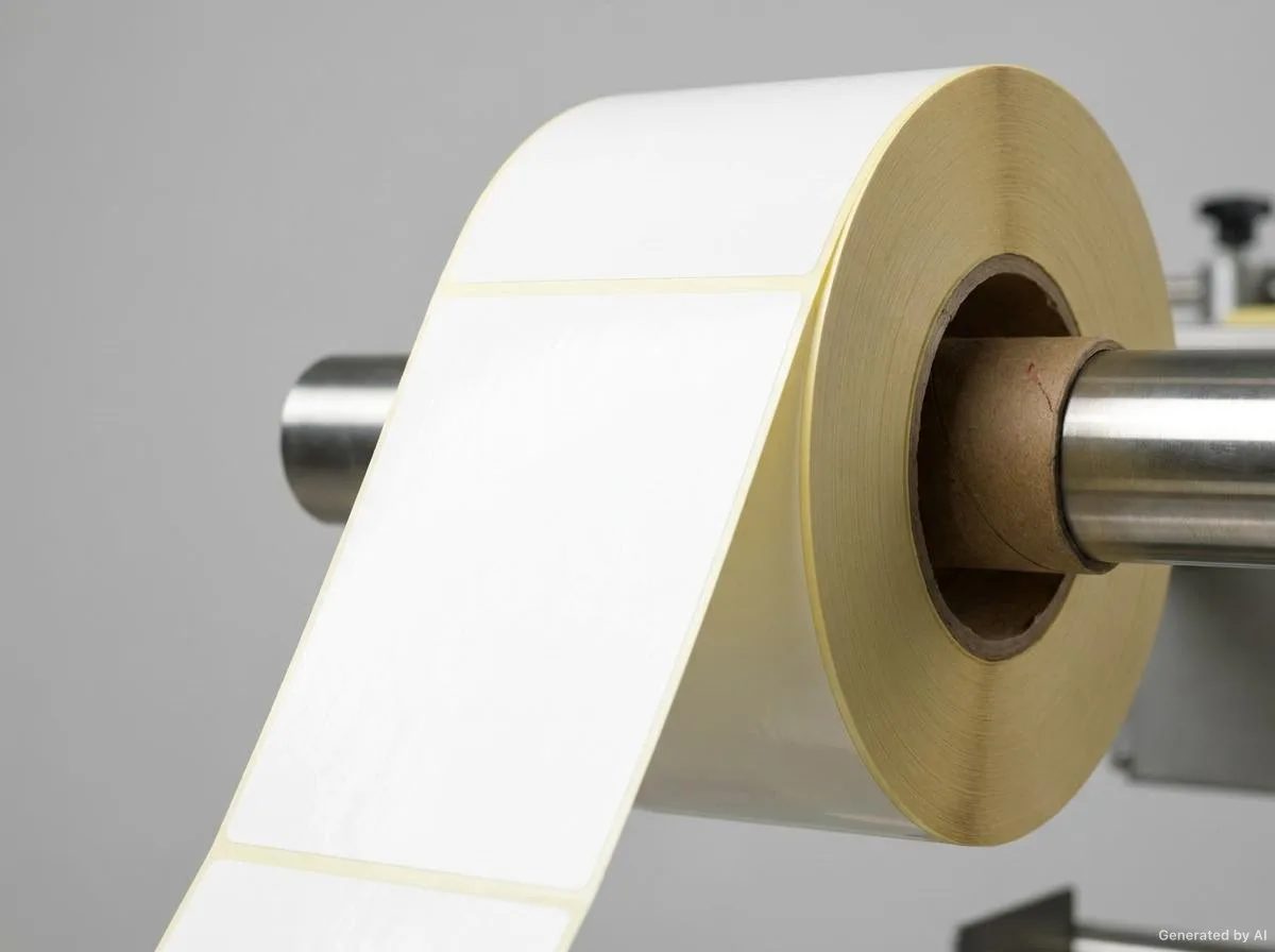
Whether the application is done by hand or by machine determines the roll or sheet format.
Sharing this information speeds up the quotation and technical evaluation process and reduces the need for changes during production.
It is fine if you do not have complete information; we can start with what you have and complete the rest together.
Request a Quote on WhatsAppCosmetic Labels
Transparent labels preserve the colour of the glass surface and the product appearance; they leave a lighter effect on the product. Matte labels, on the other hand, bring the brand message and the premium perception to the fore. The choice is made according to the product's shelf strategy.
A label width suited to the bottle diameter, a flexible material and an adhesive suited to the surface are evaluated together. On very wide labels that wrap the entire bottle circumference, edge lift is seen more often because of the curvature.
It may not fit. In this case, enlarging the label size, arranging the font sizes hierarchically or moving secondary information to a separate panel is recommended.
Differences in background colours can occur across separate print runs. Planning the variants of the same range together and taking a sample for approval help keep the colour consistent.
It depends on the usage conditions. Protective surface options can be evaluated for humid and high-friction use; the definitive result is verified by an application test.
Roll Labels
Die-cut roll labels on a carrier liner, applied quickly by machine.
Food Labels
Legible food labels suited to the packaging type and storage conditions.
Industrial Labels
Labels resistant to temperature, moisture, abrasion and chemical contact.
Textile Labels
Self-adhesive labels used on textile and leather products.
Barcode Labels
Barcode and variable-data labels planned for readability.
Custom-Production Labels
Labels requiring non-standard size, shape and design.
Cosmetic bottle/jar surfaces, material and surface finish selection, typography, color management, printing methods and a detailed design checklist.
Read the article
We compare matte and gloss surface finishes in terms of light reflection, fingerprint and smudge visibility, premium perception, barcode readability, print vibrancy, lamination and cost, and explain which one suits which product.
Read the article
We examine what transparent labels are, which products and sectors prefer them, the “no-label look” aesthetic, their advantages and disadvantages, and application challenges, by product group.
Read the articleShare the size, quantity, surface and usage conditions; we will carry out the technical evaluation and get back to you.
The images on this page are representative; they do not show a specific customer product or order.