Cosmetic Label Design: How to Build Premium Brand Perception
Cosmetic bottle/jar surfaces, material and surface finish selection, typography, color management, printing methods and a detailed design checklist.
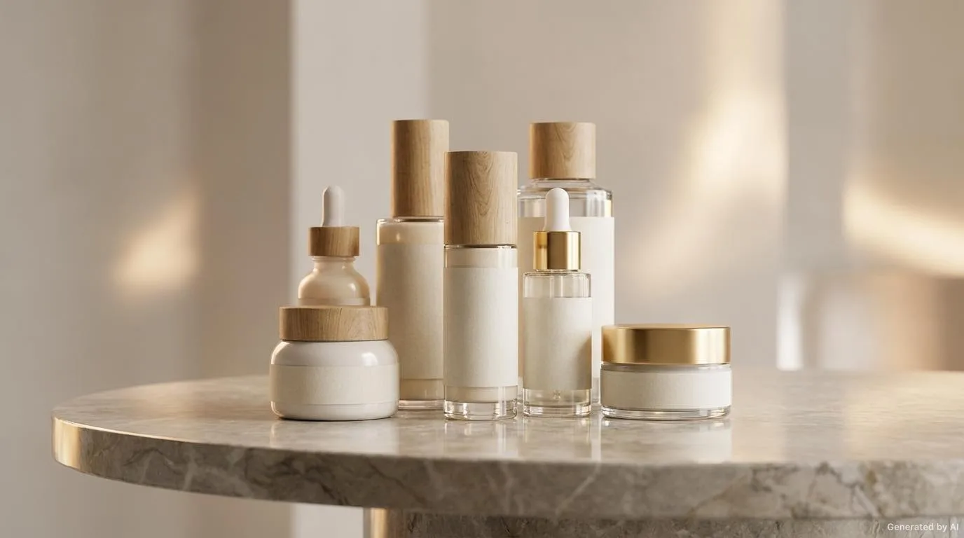
In cosmetic products, the label is one of the most important elements that determine the shelf value of the product. The consumer sees the label before buying the product, and brand perception takes shape at that moment. A premium cosmetic label must balance aesthetic appeal and technical suitability. On shelves where competition in the cosmetics sector is intense, standing out among dozens of products with the same function depends largely on the visual and tactile experience the label offers. In this article, we will examine in detail the key points in cosmetic label design, from material and surface selection to typography, from color management to application control.
The Role of the Label in Cosmetic Packaging
In cosmetics, the label is not only a carrier of information but also the first point of contact with the brand. As much as the content of the product, the surface that presents it influences the purchase decision.
Shelf Appearance and First Impression
On a store shelf, a consumer looks at a product for only a few seconds. In this short time, the label is perceived as a whole through its color, gloss, texture and typography. An eye-catching label can make the product seem more expensive and higher in quality.
The Label Share in Brand Perception
A consistent label language ensures that the brand is remembered as a whole together with its other products. Keeping the logo, typography and color palette the same across every product builds a strong brand identity over time.
Bottle and Jar Surfaces
Cosmetic products are generally offered in glass, PET, PP or acrylic bottles and jars. Each surface requires a different label material and application:
- Glass bottle: Transparent or opaque glass. Transparent BOPP/PET film labels or metallic-effect labels provide a premium look.
- PET bottle: Flexible surface. BOPP film labels adapt to the curve of the bottle.
- PP/acrylic jar: Low-to-medium energy surface. Special adhesives and film labels are required.
Glass Surfaces
Glass is a smooth, high surface energy material; therefore many adhesives bond to glass easily. However, with transparent labels, aesthetic issues such as air bubbles and edge visibility must be considered. Metallized and foil-effect labels give a particularly luxurious effect on glass.
Plastic Surfaces
PET, PP and acrylic may have lower surface energy than glass. Especially on low energy surfaces such as PP and acrylic, adhesive selection becomes critical. The wrong adhesive can cause the label to slide or lift at the corners over time.
Surface Energy and Adhesion
For the label to adhere for a long time, the surface energy and the adhesive type must be compatible. Ensuring the surface is clean, dry and free of oil before application directly affects adhesion performance.
Material and Surface Finish Selection
The materials and surface finishes used in cosmetic labels reflect the brand positioning:
- Matte surface: Offers a luxurious, natural and understated look. Especially preferred by organic and natural cosmetic brands.
- Glossy surface: Vivid colors and high gloss. Suitable for young and dynamic brands.
- Soft touch: Gives a smooth and velvety feel when touched. Ideal for the premium segment.
- Metallic effects: Luxurious look with gold, silver or holographic foil stamping.
- Transparent label: Shows the color and texture of the product, offering a modern aesthetic.
Paper, Film and Metallized Alternatives
When choosing the label material, the usage conditions of the product should also be considered. Water-resistant film labels can be preferred for products used in the bathroom or in humid environments, while textured paper labels can be used for dry-use products.
Material Comparison
| Material | Appearance | Durability | Suitable Use |
|---|---|---|---|
| Matte coated paper | Natural, understated | Medium | Organic, natural cosmetics |
| Glossy coated paper | Vivid, eye-catching | Medium | Young brands, promotions |
| BOPP transparent film | Transparent, modern | High (water/moisture) | Shampoo, shower products |
| Metallized paper/foil | Luxurious, metallic | Medium-high | Premium serum, perfume |
| Soft touch film | Velvety, matte | High | Premium skincare |
Typography and Readability
Fonts in cosmetic labels reflect the brand personality. However, aesthetics and readability must be balanced:
- Special or decorative fonts can be used for the brand name, but the product name and ingredient information should be printed in legible fonts.
- Font size should be readable for legal information and the ingredient list.
- There should be sufficient contrast between the background and the text color.
- Very small text negatively affects the consumer experience.
Font Selection
Serif fonts give a classic and sophisticated impression, while sans-serif fonts offer a modern and minimal look. Decorative and script fonts should be used only for short text such as the brand name; readability should be prioritized in longer text.
Information Hierarchy
In a label there are different information layers such as the brand name, product name, ingredients and usage information. If these layers are arranged hierarchically with differences in size and weight, the consumer quickly finds the information they are looking for.
Color and Brand Consistency
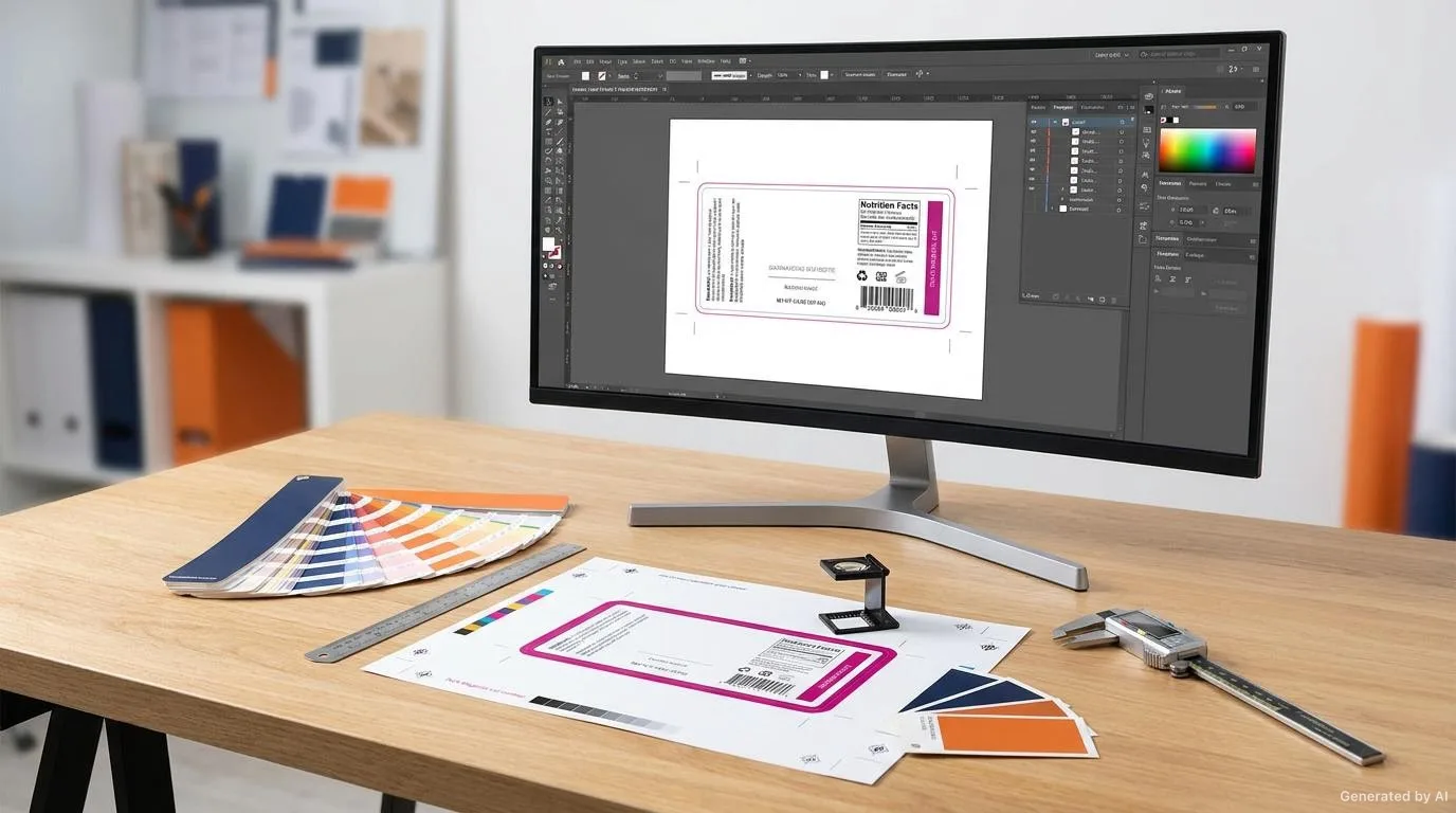
Label colors should be compatible with the brand color palette and provide consistency within the product line. Color coding can be used in series products (for example different flavors or serums). However, brand identity (logo, typography) should remain the same on every product. Pantone or CMYK color management should be used for color accuracy in printing.
Color Management
The color seen on screen and the color in print may not always be exactly the same. Therefore, reference color values (such as Pantone) should be defined for corporate colors and these values should be taken as the basis during the printing process.
Color Coding in Series Products
Marking each variant in a product family with a different color tone makes it easier for the consumer to quickly find the right product. However, this coding should be designed in a way that does not distort the main identity of the brand.
Printing Methods and Surface Effects
The printing techniques used in cosmetic labels determine the texture and perception of the label:
| Method / Effect | Impact | Use |
|---|---|---|
| Offset printing | Sharp detail, wide color range | High-volume paper labels |
| Digital printing | Low volume, variable data | Launches, limited series |
| Gold/silver foil stamping | Metallic luxurious look | Premium accents |
| Embossing | Three-dimensional tactile feel | Logo and brand name |
| Spot UV varnish | Local gloss-matte contrast | Eye-catching details |
Real Usage Scenarios
Facial Serum
A combination of a matte, soft touch film label with a metallic logo on a transparent glass bottle strengthens the premium skincare perception. A transparent label highlights the color of the product.
Moisturizer Cream Jar
On a low energy surface such as a PP jar, a strong adhesive that does not lift at the corners should be preferred. A matte paper label provides a natural and clean look.
Natural and Organic Products
For products with natural ingredients, recyclable paper labels and earthy color tones align with the brand values. Understated typography supports the message of naturalness.
Design and Application Checklist
- Bottle/jar surface and label material compatible.
- Surface finish suitable for brand positioning (matte, glossy, soft touch).
- Brand name and logo clear and legible.
- Product name, ingredients and usage information in readable size.
- Colors consistent with the brand palette.
- Legal information requirements confirmed with the relevant authority.
- Label sits properly on the bottle (no wrinkles, sliding).
- Fading and peeling tested over shelf life.
- Sample print tried on the actual bottle.
- Edges neat when the label is applied to a curved surface.
Common Mistakes
- Prioritizing aesthetics and ignoring readability.
- Choosing an adhesive not suitable for the surface energy.
- Assuming screen color is the same as print color.
- Using inconsistent typography and color across the product line.
- Skipping the sample test and going directly to production.
Conclusion
Cosmetic label design requires a delicate balance between aesthetics and technical suitability. Premium brand perception is achieved through correct material selection, surface finish, typography and color management. Pre-production sample testing and application testing on the bottle is the most reliable way to verify that the expected appearance is achieved.
To discuss material and surface recommendations suitable for your packaging, you can browse our products page and we can plan your label solutions together.
To see the impact of material selection on label lifespan from a broader perspective, you can look at our articles on coated paper and film label comparison and the role of the label in brand perception in packaging design.
Frequently Asked Questions
Which surface finish is preferred for premium cosmetic labels?
Soft touch and matte finishes create a luxurious and natural perception, while glossy suits young and dynamic brands. The choice depends on brand positioning.
Which label material is used on glass bottles?
Transparent BOPP/PET film labels or metallic-effect labels provide a premium look on glass.
How is readability ensured in label design?
The product name and ingredient information should be printed in legible fonts, at sufficient size and with good contrast against the background.
How is color accuracy ensured?
Reference values such as Pantone should be defined for brand colors, and printing should be planned with CMYK color management.
Why is a pre-production sample test important?
A sample test is the most reliable way to verify how the label looks and adheres on the actual bottle.
Want to Determine the Right Label for Your Product?
Share your usage area and needs with us; let's evaluate suitable options together.