How Labels Shape Brand Perception in Packaging Design
A practical guide to how labels affect brand perception through shelf visibility, material texture, finishing options and information hierarchy.
The first contact a product makes on the shelf usually happens through its packaging and the label on that packaging. Before shoppers even pick a product up, they form an impression within seconds, and a large part of that impression is based on visual and tactile cues.
This article looks at how labels shape brand perception in packaging design, covering first impression and shelf visibility, material texture, finishing options, colour and typography consistency, information hierarchy and the components of a premium feel. The goal is to help you make design decisions in a conscious and measurable way.
First impression and shelf visibility
The shelf is a competitive space where products are evaluated quickly. Shopper attention is limited, so a label has to work at two distances: recognition from afar and persuasion up close. From a distance, the colour block, the weight of the typography and the overall composition stand out. Up close, material texture, fine details and legibility become decisive.
A three second review
Review your label for three seconds, first from a distance and then up close. From a distance, is the product category clear, is the brand name readable, and does the product stand out from its neighbours? The answers show the basic performance of the packaging design. Evaluating the label under different lighting conditions and at different shelf heights also gives a more realistic idea of the in store experience.
Standing apart from shelf neighbours
Products in the same category often use similar colour codes. In some categories green suggests freshness and a natural character, while in others dark and gold tones are associated with premium positioning. Your label should follow category codes while also carrying a recognisable element that belongs to your brand. That element can be a distinctive colour tone, characteristic typography or a repeating graphic motif.
Material texture: matte, gloss and soft-touch
The texture of a label determines the first physical impression in the hands of the shopper. Choosing a texture is not only an aesthetic decision; it is also directly linked to durability and product positioning.
- Matte: Diffuses light and creates a calm, sophisticated feel. A common choice for content led and minimal designs.
- Gloss: Makes colours look vivid and saturated. Suitable for attracting attention from a distance and highlighting graphics.
- Soft-touch: Offers a velvety, soft surface. Used in cosmetics and luxury segments that aim for a tactile experience.
Storage conditions should also be considered when selecting a surface. In humid environments matte surfaces can show fingerprints and marks, and on heavily handled products it is worth testing how the texture behaves over time.
Finishing options
Finishing is a powerful tool for deciding which element of the design should be emphasised. Highlighting every element on a label tends to have a similar result to highlighting none. Finishing decisions should therefore be planned together with the information hierarchy.
| Finish | Perception | Suitable use |
|---|---|---|
| Matte lamination | Calm and premium | Minimal and content led designs |
| Gloss lamination | Vivid and eye catching | Colourful graphics and shelf visibility |
| Soft-touch | Tactile luxury | Cosmetics and premium segment |
| Spot varnish | Emphasised and elegant | Logo and main message emphasis |
| Foil effect | Ornate and special | Limited editions and gift products |
Because finishing options affect the production process and cost, early contact with the production team during the design stage is useful. This helps achieve a result that is both aesthetically strong and technically feasible.
Colour and typography consistency
Brand perception is a whole that accumulates over time. If the colour tone used in one series drifts in the next, the shopper may struggle to recognise the product as belonging to the same brand. Colour management and a consistent printing process are therefore important in label production.
Typography behaves in a similar way. The font family and hierarchy defined for headings, subheadings and body text should be maintained across the whole product family. Using different weights on different products can enrich the design, but the core typographic language should stay stable.
We also discuss this subject in more detail for premium cosmetics in cosmetics label design and premium brand perception. To avoid common pitfalls during the design process, our article on common mistakes in label design may also be helpful.
Information hierarchy
A label carries many pieces of information at once: brand name, product name, variant, contents, weight, usage information and mandatory legal areas. If all of this is presented with equal weight, the shopper does not know what to focus on. A good hierarchy makes the most important message available in the first second and keeps secondary information reachable when the shopper looks for it.
Legibility and accessibility
Font size, contrast and line spacing determine the functional as well as the aesthetic quality of a label. Thin fonts at small sizes can produce hard to read results. Having enough contrast between the background colour and the text colour makes a difference, especially in low light and during quick reading.
The components of a premium feel
A premium feel does not come from a single element but from the harmony of many small decisions. Effective use of white space, balanced typography, a restrained colour palette and high quality finishing make a product appear calm and trustworthy on crowded shelves.
- White space: Lets the design breathe and strengthens the main message.
- Restrained palette: The consistent use of two or three main colours is often perceived as more sophisticated.
- Quality finishing: The quality of the texture and print directly affects perceived quality.
- Detail consistency: Margins, alignment and icon language should be the same across the whole series.
Packaging and label harmony
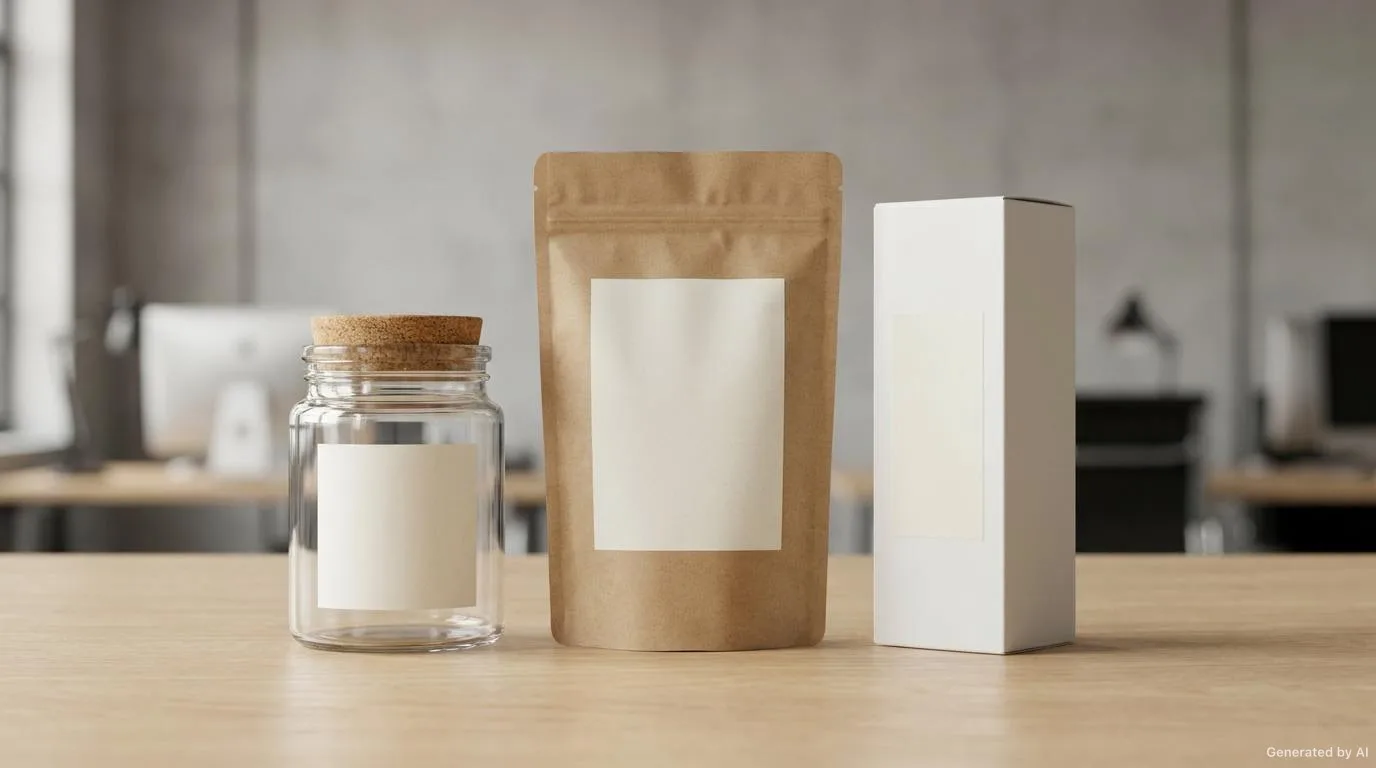
A label is part of the packaging and should not be designed independently of it. The form, curves and colour of the packaging affect how the label is read. On cylindrical packaging the label is read as it turns, while on angular packaging the transitions between surfaces should be planned.
The position of the label on the packaging should also be consistent with how the product will be displayed. On shelves, products are often seen mainly from the front, so placing the main message on the front at a full viewing angle is important.
Shelf dynamics and reading order
Shelf visibility is not only about colour and size; reading order matters too. The shopper eye usually scans the shelf from left to right, groups similar products and then picks the most eye catching one. Being noticed early in that scan increases the chance that your product is evaluated. Placing the main elements in the upper and middle part of the scanned area is therefore often an advantage.
Shelf conditions can also vary from store to store. In some stores shelves are packed while in others they are more open. Evaluating your label at different densities and among different neighbouring product groups helps you see how the design behaves in every condition.
Balancing finishing and legibility
It matters that the choice of finishing does not conflict with the information hierarchy. A dense effect covering the whole surface, for example, can make text hard to read. Finishing is therefore usually more effective when used selectively, only on the elements you want to emphasise.
Layered information structure
It can help to think of the information hierarchy as three layers. The first layer is the brand and product identity; it is visible from a distance and carries the strongest emphasis. The second layer is short messages that convey the main benefit or difference of the product. The third layer is detail such as contents, usage and mandatory information. When these layers are stacked, the shopper first recognises the product, then understands it, and finally moves into the detail.
Quality consistency
Another factor that strengthens the premium feel is the consistency of print and material quality. If some labels in a product series look glossier and others more matte, these small differences can weaken the overall perception of quality. Applying material and print decisions to the same standard across the whole series therefore supports premium positioning.
Functional fit
The harmony between label and packaging is a functional matter, not only a visual one. The label must adhere cleanly to the packaging surface, its edges must not lift and it must not shift over time. Adhesion behaviour can differ on curved or textured surfaces, so it is important to test the label on the real packaging it will be applied to.
Checklist for brand consistency
- Is the label consistent with the material and texture of the packaging?
- Is the brand name readable from a distance?
- Is the colour tone consistent with the other products of the brand?
- Is the typographic hierarchy the same across the whole series?
- Is the main message perceived within the first second?
- Do font size and contrast support legibility?
- Are mandatory details complete and readable?
- Is the white space sufficient and balanced?
- Is the finishing choice consistent with the product positioning?
- Have the real product colour and texture been tested on a sample print?
Conclusion
In packaging design, the label is the quiet ambassador of the brand. From first impression to the tactile experience, and from colour consistency to information hierarchy, many small decisions shape the relationship the shopper forms with the product. Making these decisions consciously helps the product appear clearer, more trustworthy and more memorable on the shelf.
If you would like to strengthen the contribution of your labels to brand perception, you can browse our label solutions for materials and finishes suited to your product and packaging, or contact us to review your existing label together.
Frequently Asked Questions
Why is the label so important in packaging design?
The label is the first visual and physical contact between the product and the shopper; it directly affects shelf visibility and brand perception.
How do you choose between a matte and a gloss surface?
The choice depends on product positioning and usage conditions. Matte can be considered for a calm and premium feel, while gloss suits a vivid and eye catching look.
For which products is a soft-touch label suitable?
It suits cosmetics and luxury segment products that aim for a tactile experience; testing with a sample print is recommended for durability.
What is the most critical factor for brand consistency?
Applying colour, typography and composition across the whole product family according to the same design rules is the most critical factor.
Should packaging and the label be designed together?
Because the label is part of the packaging, planning it together with the form, colour and display method gives a more consistent result.
Want to Determine the Right Label for Your Product?
Share your usage area and needs with us; let's evaluate suitable options together.